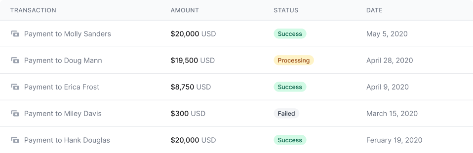
Hank 的多汁牛肉堡
- 時間
- 20分鐘
- 難度
- · 簡單
- 份量
- · 4 人份
- By
- Hank Douglas
一個功能優先的 CSS 框架,集合了 flex, pt-4, text-center 和 rotate-90 等 class 屬性,並將其組合起來建構出任意的設計。

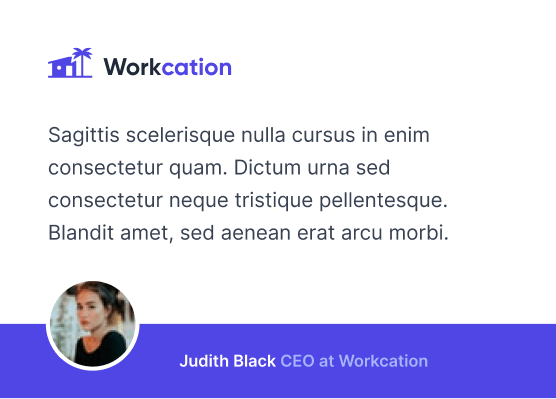
Sarah Dayan
Staff Engineer, Algolia
<figure class="md:flex bg-gray-100 rounded-xl p-8 md:p-0">
<img class="w-32 h-32 md:w-48 md:h-auto md:rounded-none rounded-full mx-auto" src="/sarah-dayan.jpg" alt="" width="384" height="512">
<div class="pt-6 md:p-8 text-center md:text-left space-y-4">
<blockquote>
<p class="text-lg font-semibold">
“Tailwind CSS 是我見過唯一一個可以在大型團隊中擴展
開來的框架。它可以輕鬆的客製化、適應任何設計,
而且建置後又很輕巧。”
</p>
</blockquote>
<figcaption class="font-medium">
<div class="text-cyan-600">
Sarah Dayan
</div>
<div class="text-gray-500">
Staff Engineer, Algolia
</div>
</figcaption>
</div>
</figure>
我大概寫了有 幾千字 就為了說明「為什麼傳統語義類 class 名稱的 CSS 會這麼難維護」這件事,但事實上,如果你沒有親自嘗試過,你永遠不會相信我。只要你願意耐心的給它一個機會,我相信你絕對會想知道怎麼透過其他的方式使用 CSS。

I feel like an idiot for not using Tailwind CSS until now.

If I had to recommend a way of getting into programming today, it would be HTML + CSS with Tailwind CSS.

I have no design skills and with Tailwind I can actually make good looking websites with ease and it's everything I ever wanted in a CSS framework.

I started using @tailwindcss. I instantly fell in love with their responsive modifiers, thorough documentation, and how easy it was customizing color palettes.

Loved it the very moment I used it.

I came into my job wondering why the last dev would ever implement Tailwind into our projects, within days I was a Tailwind convert and use it for all of my personal projects.

There’s one thing that sucks about @tailwindcss - once you’ve used it on a handful of projects it is a real pain in the ass to write normal CSS again.

Okay, I’m officially *all* in on the @tailwindcss hype train. Never thought building websites could be so ridiculously fast and flexible.

Have been working with CSS for over ten years and Tailwind just makes my life easier. It is still CSS and you use flex, grid, etc. but just quicker to write and maintain.

Okay, @tailwindcss just clicked for me and now I feel like a #!@%&$% idiot.

I've been using @tailwindcss the past few months and it's amazing. I already used some utility classes before, but going utility-first... this is the way.

After finally getting to use @tailwindcss on a real client project in the last two weeks I never want to write CSS by hand again. I was a skeptic, but the hype is real.

I didn't think I was going to like @tailwindcss... spent a day using it for a POC, love it! I wish this had been around when we started our company design system, seriously considering a complete rebuild

@tailwindcss looked unpleasant at first, but now I’m hooked on it.

為您設計系統而生的 API
功能類 class 可以約束您的系統,而不會讓您在樣式表中胡亂地填數值。它們讓顏色、間距、文字版式、陰影,以及其他的一切都能井然有序的保持一致性,締造精良的設計系統。
了解詳情 -><ul class="space-y-4"> <li> <div class="w-64 h-3 bg-gradient-to-br from-fuchsia-500 to-purple-600"></div> </li> <li> <div class="w-56 h-3 bg-gradient-to-br from-fuchsia-500 to-purple-600"></div> </li> <li> <div class="w-48 h-3 bg-gradient-to-br from-fuchsia-500 to-purple-600"></div> </li> <li> <div class="w-40 h-3 bg-gradient-to-br from-fuchsia-500 to-purple-600"></div> </li> <li> <div class="w-32 h-3 bg-gradient-to-br from-fuchsia-500 to-purple-600"></div> </li> <li> <div class="w-24 h-3 bg-gradient-to-br from-fuchsia-500 to-purple-600"></div> </li> <li> <div class="w-20 h-3 bg-gradient-to-br from-fuchsia-500 to-purple-600"></div> </li> <li> <div class="w-16 h-3 bg-gradient-to-br from-fuchsia-500 to-purple-600"></div> </li> <li> <div class="w-12 h-3 bg-gradient-to-br from-fuchsia-500 to-purple-600"></div> </li> <li> <div class="w-10 h-3 bg-gradient-to-br from-fuchsia-500 to-purple-600"></div> </li></ul>你能創造你想要的一切,沒唬你
因為 Tailwind 就是這麼簡單,所以它絕對不會鼓勵你設計兩次同樣的網站。即使用了同個色票和尺寸,但它可以很輕易的讓你在下個專案中用同樣的元件,做出完全不同的設計。
快開始吧! -><div class="flex">
<div class="flex-none w-48 relative">
<img src="/classic-utility-jacket.jpg" alt="" class="absolute inset-0 w-full h-full object-cover" />
</div>
<form class="flex-auto p-6">
<div class="flex flex-wrap">
<h1 class="flex-auto text-xl font-semibold">
經典功能性外套
</h1>
<div class="text-xl font-semibold text-gray-500">
$110.00
</div>
<div class="w-full flex-none text-sm font-medium text-gray-500 mt-2">
有現貨
</div>
</div>
<div class="flex items-baseline mt-4 mb-6">
<div class="space-x-2 flex">
<label>
<input class="w-9 h-9 flex items-center justify-center bg-gray-100 rounded-lg" name="size" type="radio" value="xs" checked>
XS
</label>
<label>
<input class="w-9 h-9 flex items-center justify-center" name="size" type="radio" value="s">
S
</label>
<label>
<input class="w-9 h-9 flex items-center justify-center" name="size" type="radio" value="m">
M
</label>
<label>
<input class="w-9 h-9 flex items-center justify-center" name="size" type="radio" value="l">
L
</label>
<label>
<input class="w-9 h-9 flex items-center justify-center" name="size" type="radio" value="xl">
XL
</label>
</div>
<div class="ml-auto text-sm text-gray-500 underline">尺碼表</div>
</div>
<div class="flex space-x-3 mb-4 text-sm font-medium">
<div class="flex-auto flex space-x-3">
<button class="w-1/2 flex items-center justify-center rounded-md bg-black text-white" type="submit">立即購買</button>
<button class="w-1/2 flex items-center justify-center rounded-md border border-gray-300" type="button">加到購物車</button>
</div>
<button class="flex-none flex items-center justify-center w-9 h-9 rounded-md text-gray-400 border border-gray-300" type="button" aria-label="like">
<svg width="20" height="20" fill="currentColor">
<path fill-rule="evenodd" clip-rule="evenodd" d="M3.172 5.172a4 4 0 015.656 0L10 6.343l1.172-1.171a4 4 0 115.656 5.656L10 17.657l-6.828-6.829a4 4 0 010-5.656z" />
</svg>
</button>
</div>
<p class="text-sm text-gray-500">
全台灣保證24h到貨,台北市6h到貨
</p>
</form>
</div>
輕巧的生產環境
Tailwind 會在生產環境編譯時自動移除沒用到的 CSS 樣式,這表示你最終的 CSS 樣式會盡可能的壓縮到最小。事實上,大部分的 Tailwind 專案在交給客戶時,CSS 大小都低於 10KB。
繼續閱讀 -><div class="fixed inset-0 flex items-end justify-center px-4 py-6 pointer-events-none sm:p-6 sm:items-start sm:justify-end">
<div class="max-w-sm w-full bg-white shadow-lg rounded-lg pointer-events-auto">
<div class="rounded-lg shadow-xs overflow-hidden">
<div class="p-4">
<div class="flex items-start">
<div class="flex-shrink-0">
<svg class="h-6 w-6 text-green-400" xmlns="http://www.w3.org/2000/svg" fill="none" viewBox="0 0 24 24" stroke="currentColor">
<path stroke-linecap="round" stroke-linejoin="round" stroke-width="2" d="M9 12l2 2 4-4m6 2a9 9 0 11-18 0 9 9 0 0118 0z" />
</svg>
</div>
<div class="ml-3 w-0 flex-1 pt-0.5">
<p class="text-sm font-medium text-gray-900">
儲存成功!
</p>
<p class="mt-1 text-sm text-gray-500">
任何知道連結的人都能瀏覽這個檔案
</p>
</div>
<div class="ml-4 flex-shrink-0 flex">
<button class="inline-flex text-gray-400 focus:outline-none focus:text-gray-500 transition ease-in-out duration-150">
<svg class="h-5 w-5" xmlns="http://www.w3.org/2000/svg" viewBox="0 0 20 20" fill="currentColor">
<path fill-rule="evenodd" d="M4.293 4.293a1 1 0 011.414 0L10 8.586l4.293-4.293a1 1 0 111.414 1.414L11.414 10l4.293 4.293a1 1 0 01-1.414 1.414L10 11.414l-4.293 4.293a1 1 0 01-1.414-1.414L8.586 10 4.293 5.707a1 1 0 010-1.414z" clip-rule="evenodd" />
</svg>
</button>
</div>
</div>
</div>
</div>
</div>
</div>
任何東西,都能是響應式的
CSS裡,有一堆令人頭痛又複雜的 media 查詢語法, 所以 Tailwind 直接讓你的 HTML 建造出響應式設計。
將螢幕的尺寸擺在任何功能性 class 前面,看看它如何神奇的變化。
整個房源
 房東:Kevin Francis
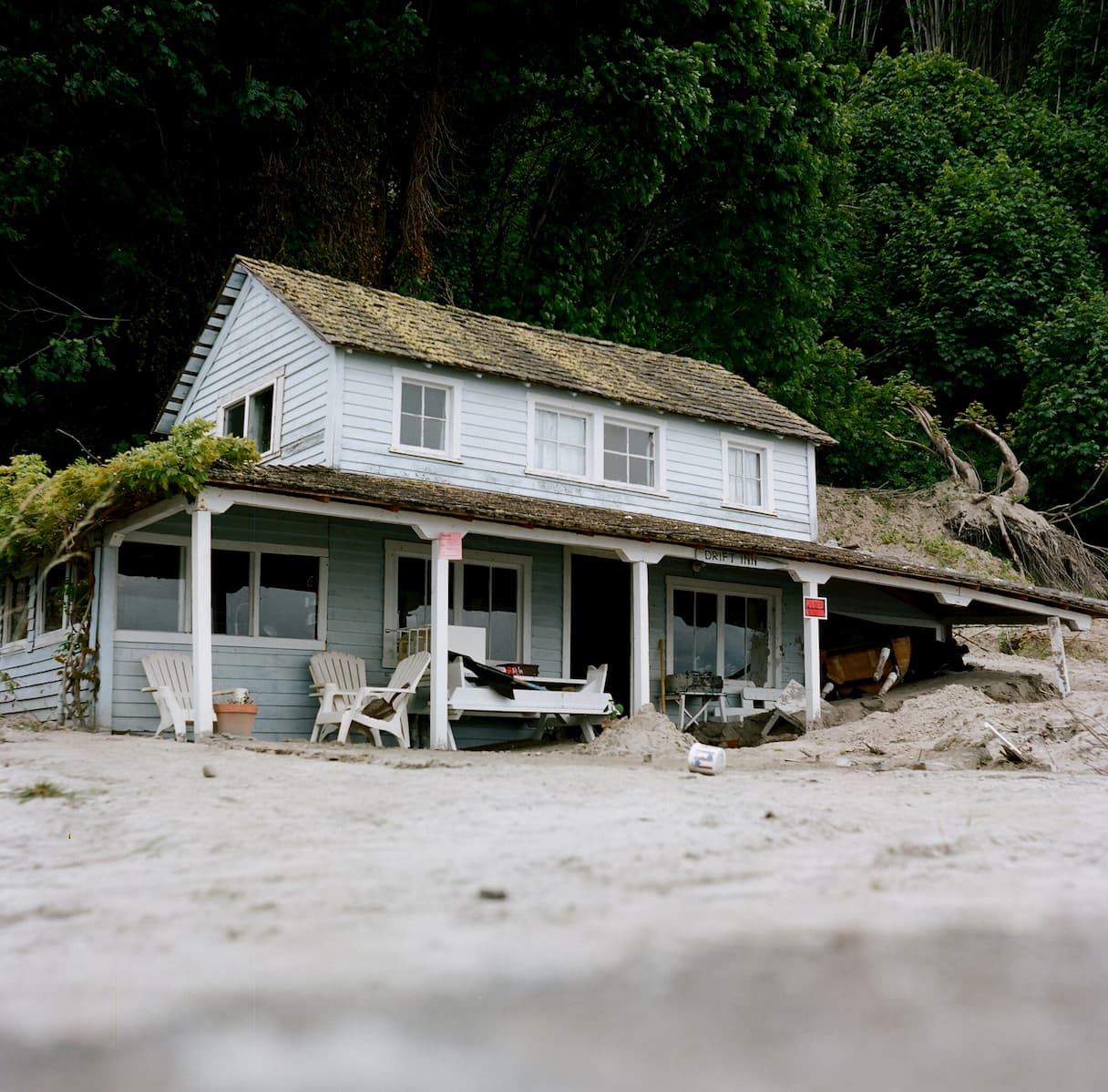

<div class="grid grid-cols-1 sm:grid-cols-2 sm:px-8 sm:py-12 sm:gap-x-8 md:py-16"> <div class="relative z-10 col-start-1 row-start-1 px-4 pt-40 pb-3 bg-gradient-to-t from-black sm:bg-none"> <p class="text-sm font-medium text-white sm:mb-1 sm:text-gray-500">整個房源</p> <h2 class="text-xl font-semibold text-white sm:text-2xl sm:leading-7 sm:text-black md:text-3xl">科林伍德海濱別墅</h2> </div> <div class="col-start-1 row-start-2 px-4 sm:pb-16"> <div class="flex items-center text-sm font-medium my-5 sm:mt-2 sm:mb-4"> <svg width="20" height="20" fill="currentColor" class="text-violet-600"> <path d="M9.05 3.691c.3-.921 1.603-.921 1.902 0l1.07 3.292a1 1 0 00.95.69h3.462c.969 0 1.372 1.24.588 1.81l-2.8 2.034a1 1 0 00-.364 1.118l1.07 3.292c.3.921-.755 1.688-1.539 1.118l-2.8-2.034a1 1 0 00-1.176 0l-2.8 2.034c-.783.57-1.838-.197-1.539-1.118l1.07-3.292a1 1 0 00-.363-1.118l-2.8-2.034c-.784-.57-.381-1.81.587-1.81H7.03a1 1 0 00.95-.69L9.05 3.69z" /> </svg> <div class="ml-1"> <span class="text-black">4.94</span> <span class="sm:hidden md:inline">(128)</span> </div> <div class="text-base font-normal mx-2">·</div> <div>安大略省 科林伍德</div> </div> <hr class="w-16 border-gray-300 hidden sm:block"> </div> <div class="col-start-1 row-start-3 space-y-3 px-4"> <p class="flex items-center text-black text-sm font-medium"> <img src="/kevin-francis.jpg" alt="" class="w-6 h-6 rounded-full mr-2 bg-gray-100"> 房東:Kevin Francis </p> <button type="button" class="bg-violet-100 text-violet-700 text-base font-semibold px-6 py-2 rounded-lg">預約入住</button> </div> <div class="col-start-1 row-start-1 flex sm:col-start-2 sm:row-span-3"> <div class="w-full grid grid-cols-3 grid-rows-2 gap-2"> <div class="relative col-span-3 row-span-2 md:col-span-2"> <img src="/beach-house.jpg" alt="" class="absolute inset-0 w-full h-full object-cover bg-gray-100 sm:rounded-lg" /> </div> <div class="relative hidden md:block"> <img src="/beach-house-interior.jpg" alt="" class="absolute inset-0 w-full h-full object-cover rounded-lg bg-gray-100" /> </div> <div class="relative hidden md:block"> <img src="/beach-house-view.jpg" alt="" class="absolute inset-0 w-full h-full object-cover rounded-lg bg-gray-100" /> </div> </div> </div></div>想要 hover 和 focus 的狀態? 我們準備給你。
想要在滑鼠經過時有不同的樣式嗎?那就在你想用的 class 前面加上 hover:!同樣,你也能加上 focus、active、disabled、focus-within、focus-visible,甚至是我們自己發明的超酷炫狀態 group-hover 。
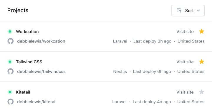
<section class="px-4 sm:px-6 lg:px-4 xl:px-6 pt-4 pb-4 sm:pb-6 lg:pb-4 xl:pb-6 space-y-4"> <header class="flex items-center justify-between"> <h2 class="text-lg leading-6 font-medium text-black">Projects</h2> <button class="hover:bg-light-blue-200 hover:text-light-blue-800 group flex items-center rounded-md bg-light-blue-100 text-light-blue-600 text-sm font-medium px-4 py-2"> <svg class="group-hover:text-light-blue-600 text-light-blue-500 mr-2" width="12" height="20" fill="currentColor"> <path fill-rule="evenodd" clip-rule="evenodd" d="M6 5a1 1 0 011 1v3h3a1 1 0 110 2H7v3a1 1 0 11-2 0v-3H2a1 1 0 110-2h3V6a1 1 0 011-1z"/> </svg> 建立 </button> </header> <form class="relative"> <svg width="20" height="20" fill="currentColor" class="absolute left-3 top-1/2 transform -translate-y-1/2 text-gray-400"> <path fill-rule="evenodd" clip-rule="evenodd" d="M8 4a4 4 0 100 8 4 4 0 000-8zM2 8a6 6 0 1110.89 3.476l4.817 4.817a1 1 0 01-1.414 1.414l-4.816-4.816A6 6 0 012 8z" /> </svg> <input class="focus:border-light-blue-500 focus:ring-1 focus:ring-light-blue-500 focus:outline-none w-full text-sm text-black placeholder-gray-500 border border-gray-200 rounded-md py-2 pl-10" type="text" aria-label="Filter projects" placeholder="Filter projects" /> </form> <ul class="grid grid-cols-1 sm:grid-cols-2 lg:grid-cols-1 xl:grid-cols-2 gap-4"> <li x-for="item in items"> <a :href="item.url" class="hover:bg-light-blue-500 hover:border-transparent hover:shadow-lg group block rounded-lg p-4 border border-gray-200"> <dl class="grid sm:block lg:grid xl:block grid-cols-2 grid-rows-2 items-center"> <div> <dt class="sr-only">標題</dt> <dd class="group-hover:text-white leading-6 font-medium text-black"> {item.title} </dd> </div> <div> <dt class="sr-only">類別</dt> <dd class="group-hover:text-light-blue-200 text-sm font-medium sm:mb-4 lg:mb-0 xl:mb-4"> {item.category} </dd> </div> <div class="col-start-2 row-start-1 row-end-3"> <dt class="sr-only">用戶群</dt> <dd class="flex justify-end sm:justify-start lg:justify-end xl:justify-start -space-x-2"> <img x-for="user in item.users" :src="user.avatar" :alt="user.name" width="48" height="48" class="w-7 h-7 rounded-full bg-gray-100 border-2 border-white" /> </dd> </div> </dl> </a> </li> <li class="hover:shadow-lg flex rounded-lg"> <a href="/new" class="hover:border-transparent hover:shadow-xs w-full flex items-center justify-center rounded-lg border-2 border-dashed border-gray-200 text-sm font-medium py-4"> 新增專案 </a> </li> </ul></section>

import Nav from ''
import NavItem from ''
import List from ''
import ListItem from ''
export default function Recipes({ recipes }) {
return (
<div className="divide-y divide-gray-100">
<Nav>
<NavItem href="/featured" isActive>特色</NavItem>
<NavItem href="/popular">超人氣</NavItem>
<NavItem href="/recent">最近</NavItem>
</Nav>
<List>
{recipes.map((recipe) => (
<ListItem key={recipe.id} recipe={recipe} />
))}
</List>
</div>
)
}
想要保持老派格調,不想加入元件框架的世界中嗎?那用 Tailwind 的 @apply 指令把你重複的功能樣式集中到自訂的 CSS class 裡吧。
了解更多 ->.btn {
@apply text-base font-medium rounded-lg p-3;
}
.btn--primary {
@apply bg-rose-500 text-white;
}
.btn--secondary {
@apply bg-gray-100 text-black;
}
</dd> </div> </dl> <footer class="grid grid-cols-2 gap-x-6"> <button class="btn btn--secondary">拒絕</button> <button class="btn btn--primary">接受</button> </footer></article>現在,有深色模式了
不想在凌晨兩點,用戶在手機打開你的網站時眼睛被閃瞎嗎? 在設定文件中開啟深色模式並在任何顏色功能前加上 dark:,這麼一來,當深色模式開啟時,背景顏色、文字顏色、邊框顏色和漸層色都能發生變化。

章節 128
Full Stack 電台
<div class="bg-white dark:bg-gray-800 rounded-tl-xl sm:rounded-t-xl p-4 pb-6 sm:p-8 lg:p-4 lg:pb-6 xl:p-8 space-y-6 sm:space-y-8 lg:space-y-6 xl:space-y-8">
<div class="flex items-center space-x-3.5 sm:space-x-5 lg:space-x-3.5 xl:space-x-5">
<img src="/full-stack-radio.png" alt="" width="160" height="160" class="flex-none w-20 h-20 rounded-lg bg-gray-100" />
<div class="min-w-0 flex-auto space-y-0.5">
<p class="text-lime-600 dark:text-lime-400 text-sm sm:text-base lg:text-sm xl:text-base font-semibold uppercase">
<abbr title="Episode">章節</abbr> 128
</p>
<h2 class="text-black dark:text-white text-base sm:text-xl lg:text-base xl:text-xl font-semibold truncate">
讓 Heroku 上的 CSS 變靈活:使用 Utility Class
</h2>
<p class="text-gray-500 dark:text-gray-400 text-base sm:text-lg lg:text-base xl:text-lg font-medium">
Full Stack 電台
</p>
</div>
</div>
<div class="space-y-2">
<div class="bg-gray-200 dark:bg-black rounded-full overflow-hidden">
<div class="bg-lime-500 dark:bg-lime-400 w-1/2 h-1.5" role="progressbar" aria-valuenow="1456" aria-valuemin="0" aria-valuemax="4550"></div>
</div>
<div class="text-gray-500 dark:text-gray-400 flex justify-between text-sm font-medium tabular-nums">
<div>24:16</div>
<div>75:50</div>
</div>
</div>
</div>
<div class="bg-gray-50 text-black dark:bg-gray-900 dark:text-white lg:rounded-b-xl py-4 px-1 sm:px-3 lg:px-1 xl:px-3 grid grid-cols-5 sm:grid-cols-7 lg:grid-cols-5 xl:grid-cols-7 items-center">
<button type="button" class="mx-auto">
<svg width="24" height="24" fill="none">
<path d="M5 5a2 2 0 012-2h10a2 2 0 012 2v16l-7-3.5L5 21V5z" stroke="currentColor" stroke-width="1.5" stroke-linecap="round" />
</svg>
</button>
<button type="button" class="hidden sm:block lg:hidden xl:block mx-auto">
<svg width="17" height="18">
<path d="M0 0h2v18H0V0zM4 9l13-9v18L4 9z" fill="currentColor" />
</svg>
</button>
<button type="button" class="mx-auto">
<svg width="34" height="39" fill="none">
<path d="M12.878 26.12c1.781 0 3.09-1.066 3.085-2.515.004-1.104-.665-1.896-1.824-2.075v-.068c.912-.235 1.505-.95 1.5-1.93.005-1.283-1.048-2.379-2.727-2.379-1.602 0-2.89.968-2.932 2.387h1.274c.03-.801.784-1.287 1.64-1.287.892 0 1.475.541 1.471 1.346.004.844-.673 1.398-1.64 1.398h-.738v1.074h.737c1.21 0 1.91.614 1.91 1.491 0 .848-.738 1.424-1.765 1.424-.946 0-1.683-.486-1.734-1.262H9.797c.055 1.424 1.317 2.395 3.08 2.395zm7.734.025c2.016 0 3.196-1.645 3.196-4.504 0-2.838-1.197-4.488-3.196-4.488-2.003 0-3.196 1.645-3.2 4.488 0 2.855 1.18 4.5 3.2 4.504zm0-1.138c-1.18 0-1.892-1.185-1.892-3.366.004-2.174.716-3.371 1.892-3.371 1.172 0 1.888 1.197 1.888 3.37 0 2.182-.712 3.367-1.888 3.367z" fill="currentColor" />
<path d="M1 22c0 8.837 7.163 16 16 16s16-7.163 16-16S25.837 6 17 6" stroke="currentColor" stroke-width="1.5" />
<path d="M17 0L9 6l8 6V0z" fill="currentColor" />
</svg>
</button>
<button type="button" class="mx-auto">
<svg width="50" height="50" fill="none">
<circle class="text-gray-300 dark:text-gray-500" cx="25" cy="25" r="24" stroke="currentColor" stroke-width="1.5" />
<path d="M18 16h4v18h-4V16zM28 16h4v18h-4z" fill="currentColor" />
</svg>
</button>
<button type="button" class="mx-auto">
<svg width="34" height="39" fill="none">
<path d="M12.878 26.12c1.781 0 3.09-1.066 3.085-2.515.004-1.104-.665-1.896-1.824-2.075v-.068c.912-.235 1.505-.95 1.5-1.93.005-1.283-1.048-2.379-2.727-2.379-1.602 0-2.89.968-2.932 2.387h1.274c.03-.801.784-1.287 1.64-1.287.892 0 1.475.541 1.471 1.346.004.844-.673 1.398-1.64 1.398h-.738v1.074h.737c1.21 0 1.91.614 1.91 1.491 0 .848-.738 1.424-1.765 1.424-.946 0-1.683-.486-1.734-1.262H9.797c.055 1.424 1.317 2.395 3.08 2.395zm7.734.025c2.016 0 3.196-1.645 3.196-4.504 0-2.838-1.197-4.488-3.196-4.488-2.003 0-3.196 1.645-3.2 4.488 0 2.855 1.18 4.5 3.2 4.504zm0-1.138c-1.18 0-1.892-1.185-1.892-3.366.004-2.174.716-3.371 1.892-3.371 1.172 0 1.888 1.197 1.888 3.37 0 2.182-.712 3.367-1.888 3.367z" fill="currentColor" />
<path d="M33 22c0 8.837-7.163 16-16 16S1 30.837 1 22 8.163 6 17 6" stroke="currentColor" stroke-width="1.5" />
<path d="M17 0l8 6-8 6V0z" fill="currentColor" />
</svg>
</button>
<button type="button" class="hidden sm:block lg:hidden xl:block mx-auto">
<svg width="17" height="18" viewBox="0 0 17 18" fill="none">
<path d="M17 0H15V18H17V0Z" fill="currentColor" />
<path d="M13 9L0 0V18L13 9Z" fill="currentColor" />
</svg>
</button>
<button type="button" class="mx-auto border border-gray-300 rounded-md text-sm font-medium py-0.5 px-2 text-gray-500 dark:border-gray-600 dark:text-gray-400">
1.0x
</button>
</div>
延伸、微調和改變, 隨你喜好。
Tailwind 包含了一組專家所設計的、可以直接使用的預設值,但是其實,從色票、間距、陰影到滑鼠游標,任何東西,都是可以自訂的。
用 tailwind.config.js 設定檔來創造自己的設計系統, 讓 Tailwind 來把它轉換成屬於你客製化的 CSS 框架。
module.exports = {
theme: {
fontFamily: {
display: ['Inter', 'system-ui', 'sans-serif'],
body: ['Inter', 'system-ui', 'sans-serif'],
},
colors: {
primary: {
50: '#eef2ff',
100: '#e0e7ff',
200: '#c7d2fe',
300: '#a5b4fc',
400: '#818cf8',
500: '#6366f1',
600: '#4f46e5',
700: '#4338ca',
800: '#3730a3',
900: '#312e81',
},
gray: {
50: '#fafafa',
100: '#f4f4f5',
200: '#e4e4e7',
300: '#d4d4d8',
400: '#a1a1aa',
500: '#71717a',
600: '#52525b',
700: '#3f3f46',
800: '#27272a',
900: '#18181b',
},
},
},
}
我們,只活在尖端。
Tailwind 很潮。因為它具備最新最棒的 CSS 特色,只為了讓你的開發過程輕鬆愉快。
我們用 CSS 變數提供一流的 CSS 網格、組合式變形,和漸層,也支援像是 :focus-visible這種的現代狀態選擇器,以及更多其他功能。
<div class="grid grid-flow-col grid-rows-2 grid-cols-3 gap-4">
<div>
1
</div>
<div class="col-start-3">
2
</div>
<div>
3
</div>
<div>
4
</div>
<div class="row-start-1 col-start-2 col-span-2">
5
</div>
</div>
世界級的 IDE 整合
擔心記不住所有的 class 名稱嗎? Tailwind CSS IntelliSense 這個 VS Code 擴充套件可以掩護你!
智慧的語法建議、整理以及 class 定義等,全部在你的編輯器裡,而且還不用設定。
<div class="w-full flex items-center justify-between block p-6 space-x-6">
<div class="flex-1 truncate">
<div class="flex items-center space-x-3">
<h3 class="text-gray-900 text-sm font-medium truncate">Jane Cooper</h3>
<span class="text-teal-600">管理員</span>
</div>
<p class="mt-1 text-gray-500 text-sm truncate">Regional Paradigm Technician</p>
</div>
<img class="w-10 h-10 bg-gray-300 rounded-full flex-shrink-0" src="https://images.unsplash.com/photo-1494790108377-be9c29b29330?ixlib=rb-1.2.1&ixid=eyJhcHBfaWQiOjEyMDd9&auto=format&fit=facearea&facepad=4&w=256&h=256&q=60" alt="">
</div>
<div class="border-t border-gray-200">
<div class="-mt-px flex">
<div class="w-0 flex-1 flex border-r border-gray-200">
<a href="#" class="relative -mr-px w-0 flex-1 inline-flex items-center justify-center py-4 text-sm text-gray-700 font-medium border border-transparent rounded-bl-lg hover:text-gray-500 focus:outline-none focus:shadow-outline-blue focus:border-blue-300 focus:z-10 transition ease-in-out duration-150">
<svg class="w-5 h-5 text-gray-400" xmlns="http://www.w3.org/2000/svg" viewBox="0 0 20 20" fill="currentColor">
<path d="M2.003 5.884L10 9.882l7.997-3.998A2 2 0 0016 4H4a2 2 0 00-1.997 1.884z" />
<path d="M18 8.118l-8 4-8-4V14a2 2 0 002 2h12a2 2 0 002-2V8.118z" />
</svg>
<span class="ml-3">電子郵件</span>
</a>
</div>
</div>
</div>
'flex' applies the same CSS property as 'block'.
cssConflict [1, 20]
'block' applies the same CSS property as 'flex'.
cssConflict [1, 54]
用 Tailwind UI 快速前進
Tailwind UI 集結了我們以及所有 Tailwind CSS 的創作者所設計研發的漂亮且完全響應式的 UI 元件。那裏有數百個現成的範例讓你選擇,而且保證你能找到心目中想建構的完美起點。
了解詳情 ->